(01)
.jpg)
Studios
Digital Content Production Arm (Coming Soon)
(02)
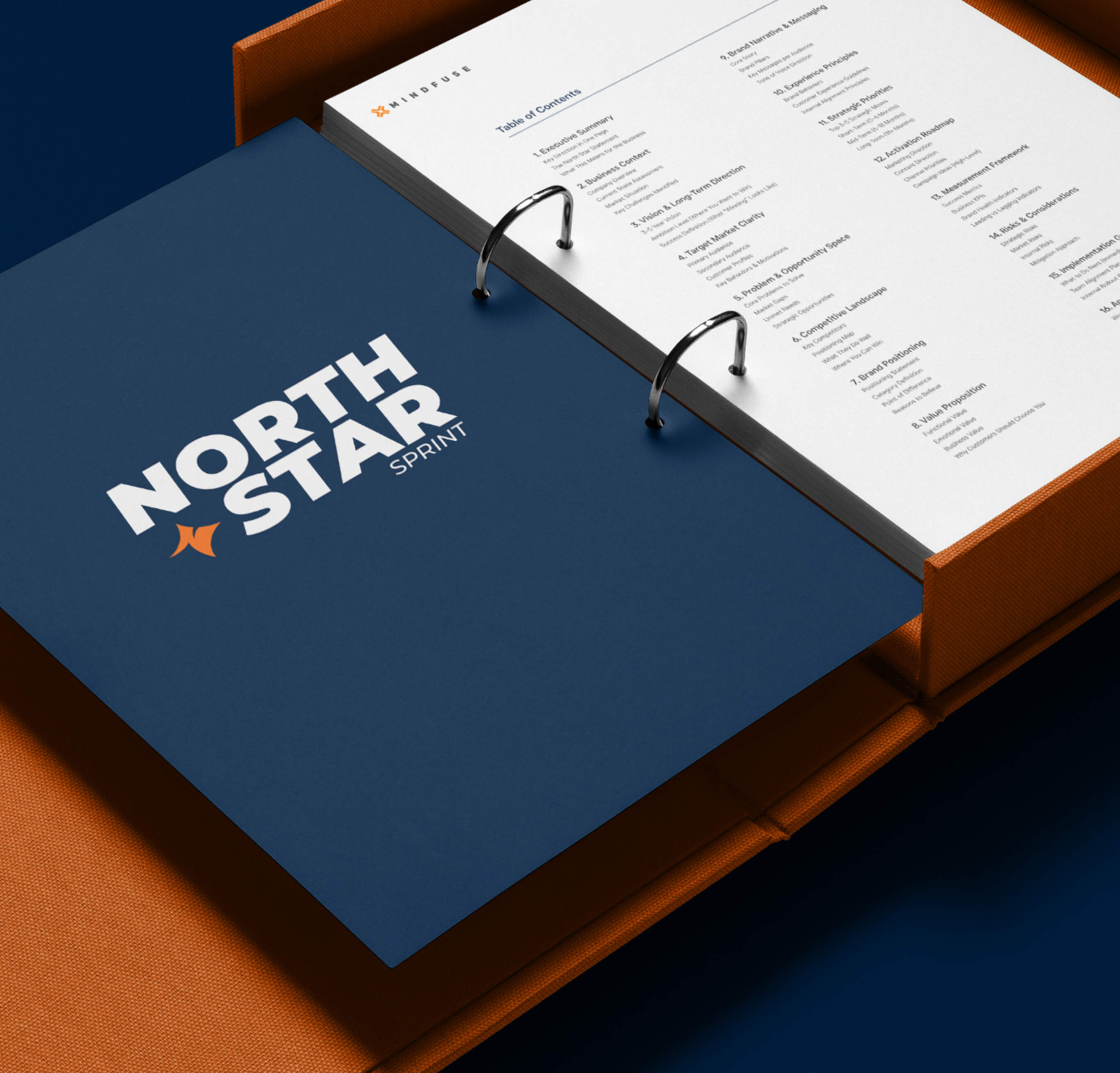
North Star Sprint
Strategic Alignment Workshop
(03)
Cortex
AI Powered Intelligence Software
(Exclusive to Clients)
(Exclusive to Clients)
Close

Fine Choices was born from personal experience. The founder, navigating the daily challenges of PCOS, realized how difficult it was to find healthy food and ingredients that actually worked, not healthy in some vague aspirational sense, but practical options she could trust and access without compromise. What started as solving her own problem became a business built around making healthy living more accessible, especially for women dealing with conditions that complicate everyday choices around food.
By the time Fine Choices came to us, the business was already running. Products were selling, customers were buying, and the mission was clear internally. But the brand wasn't keeping up. The visual identity, the messaging, and the overall brand expression felt like they belonged to an earlier version of the business, before it had found its audience and its confidence.
The founder's story was genuinely compelling. The brand just wasn't telling it well. The disconnect between what Fine Choices stood for and how it showed up in the market was limiting its ability to grow.
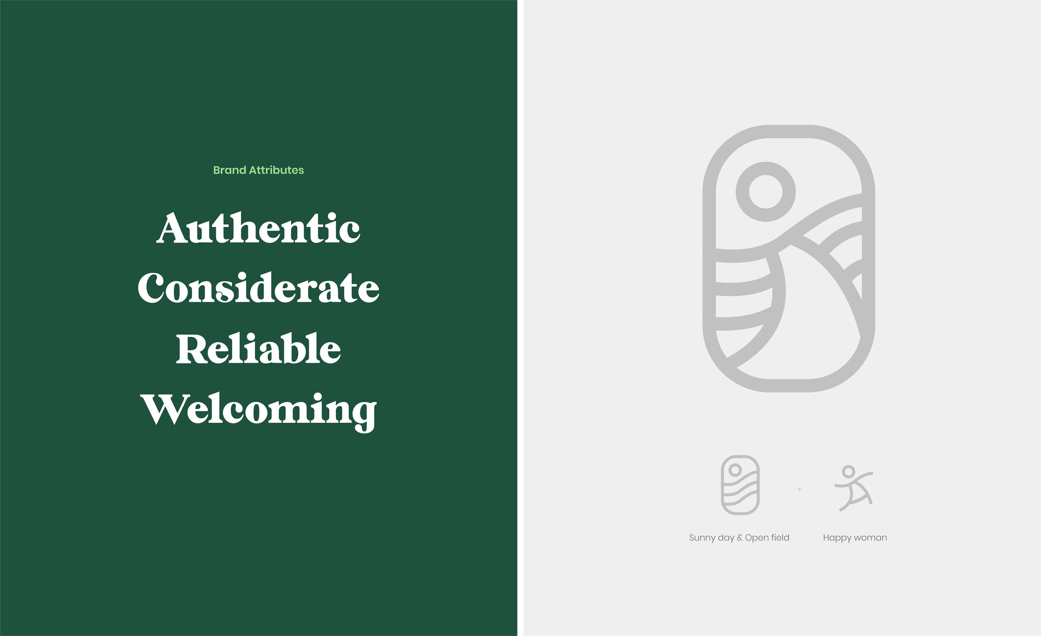
We defined a brand direction rooted in the founder's experience, not as a marketing angle, but as the source of truth for everything else. The brand needed to communicate purpose clearly without becoming so personal that it felt niche or exclusive. It had to balance empathy with credibility, warmth with professionalism, and personal story with universal relevance. Most importantly, the identity had to be built to scale, strong enough to grow with the business without needing to be rebuilt a year later.
We started with the founder's story and worked outward. Her experience with PCOS gave Fine Choices its clarity of purpose, and we built the entire brand narrative from that foundation.
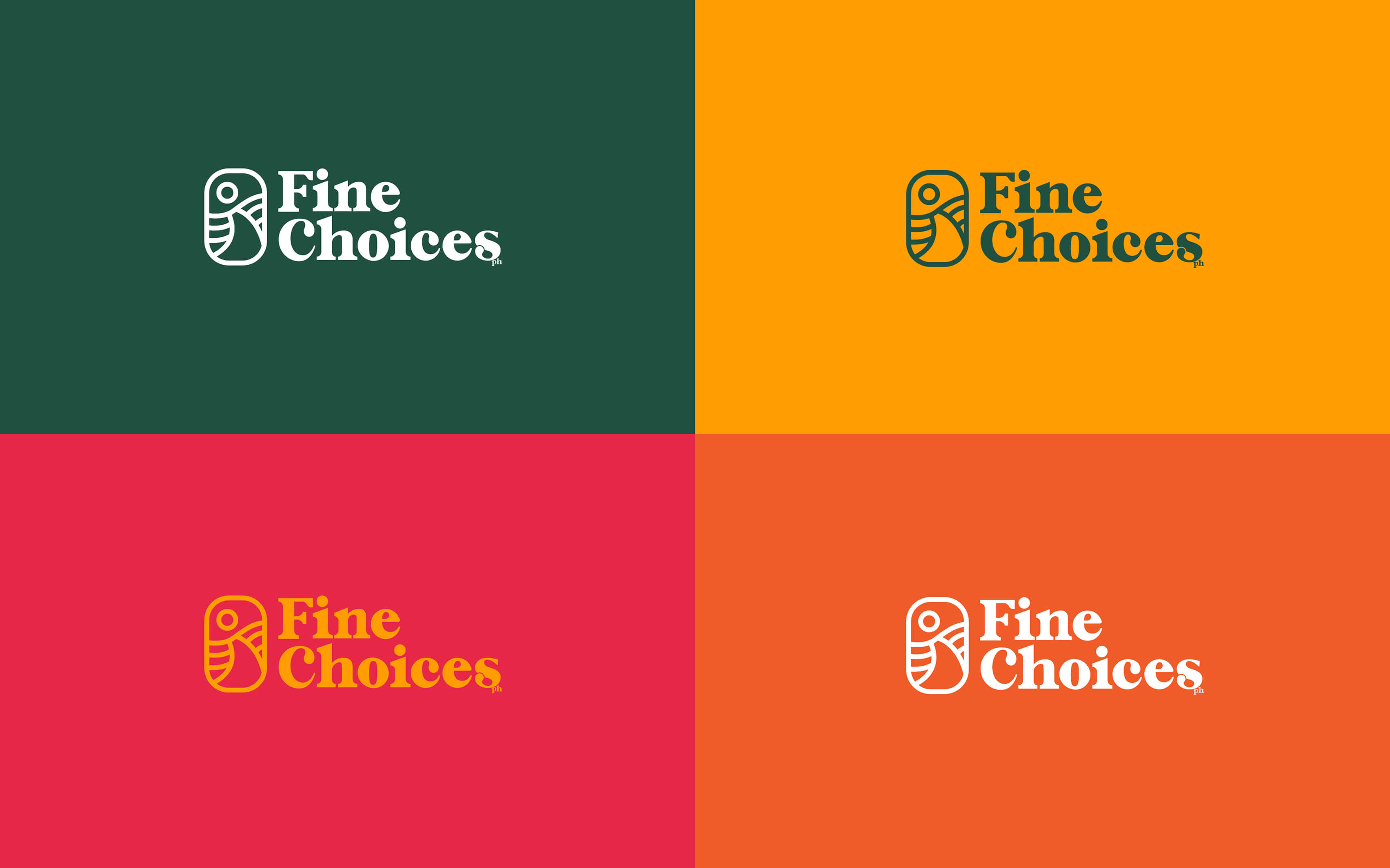
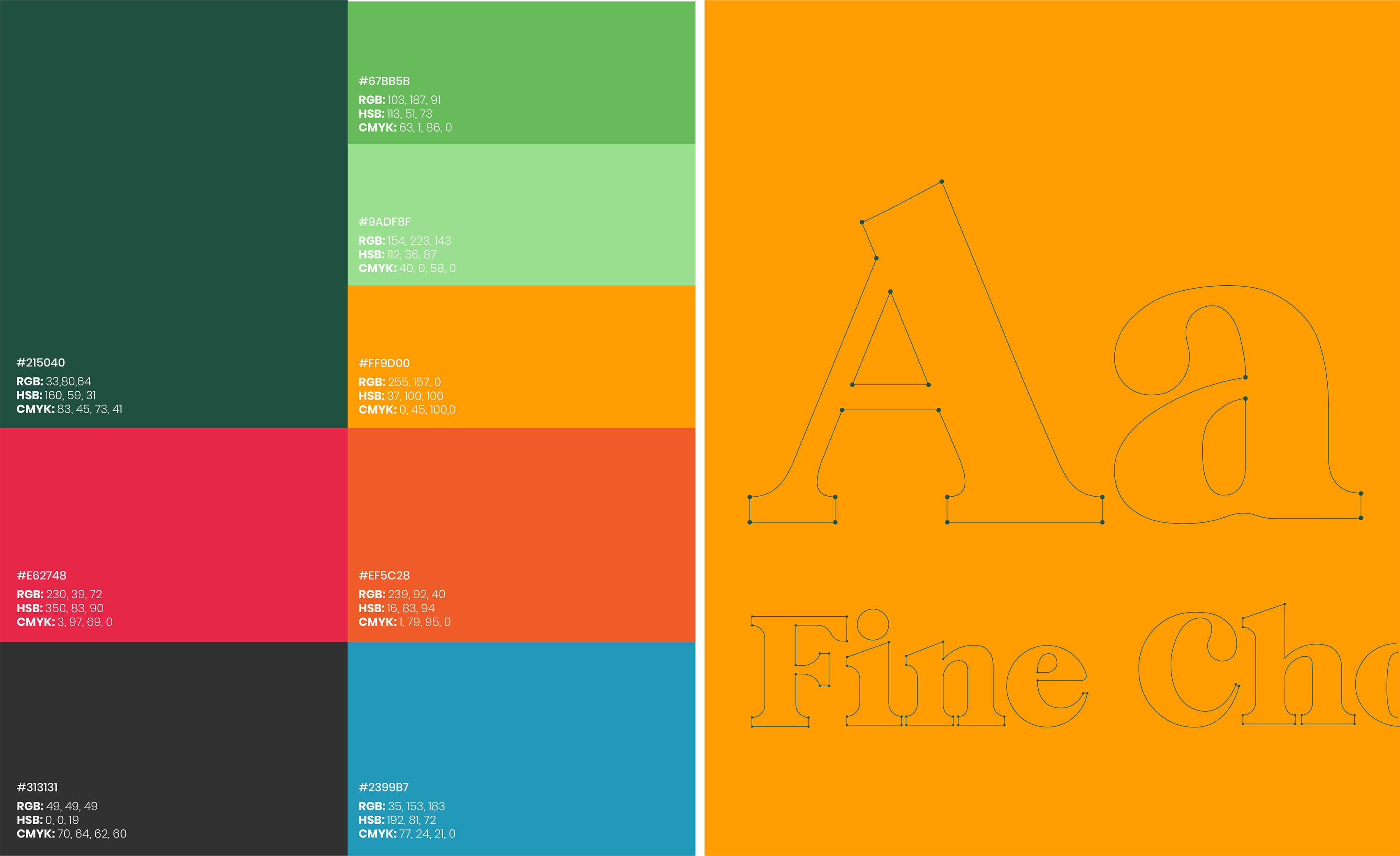
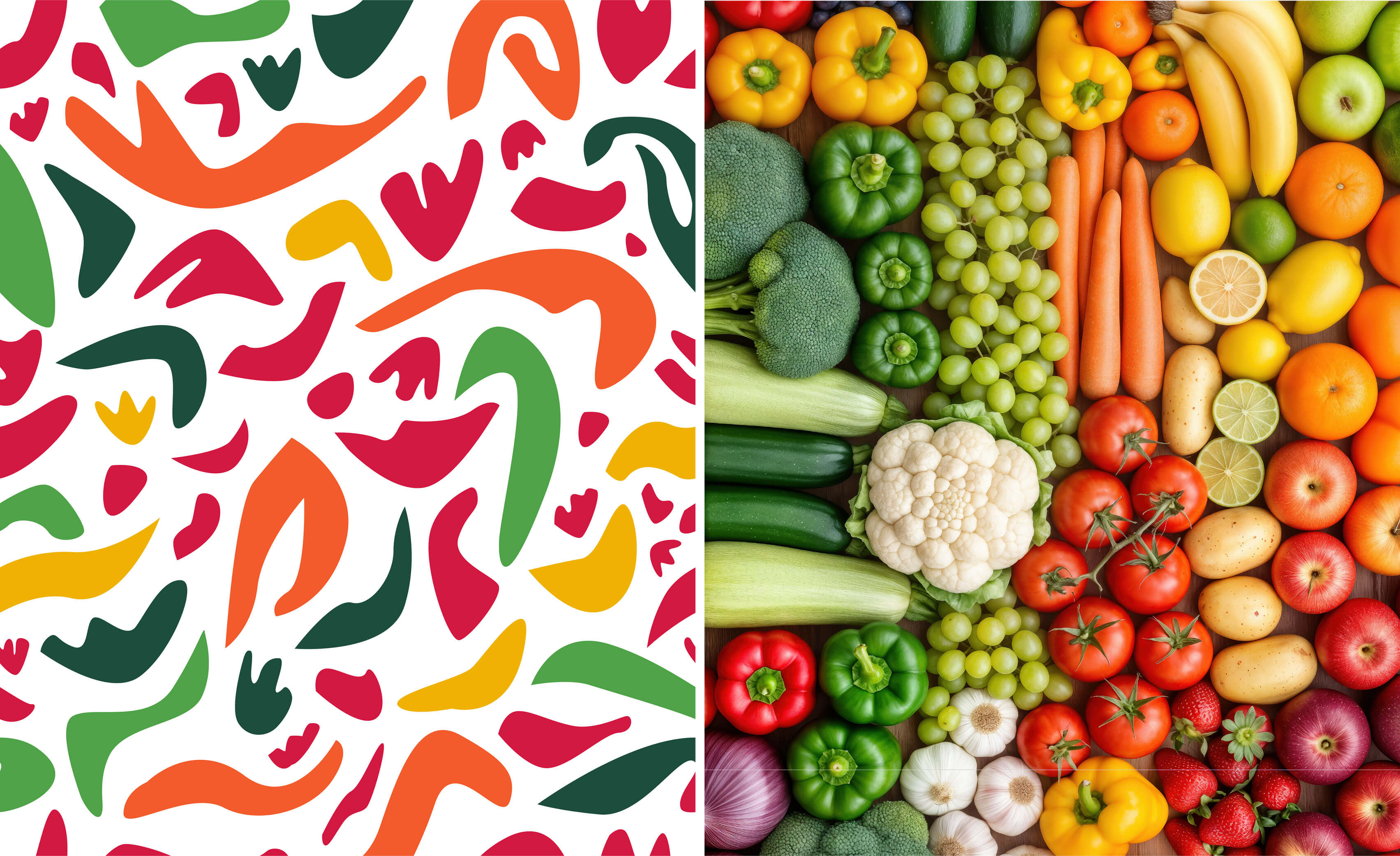
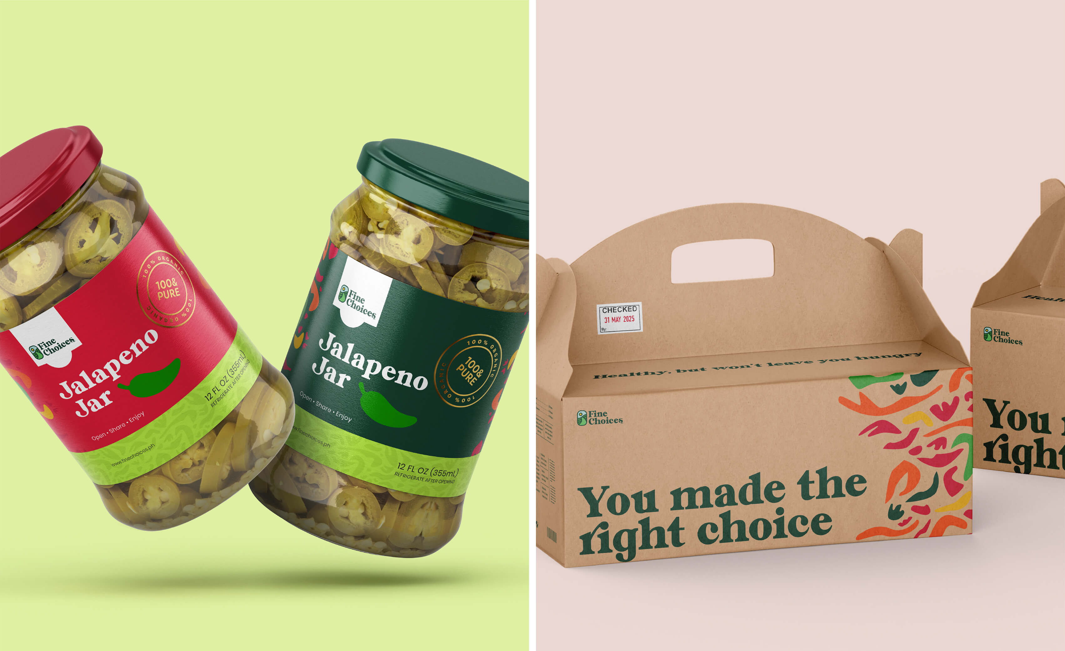
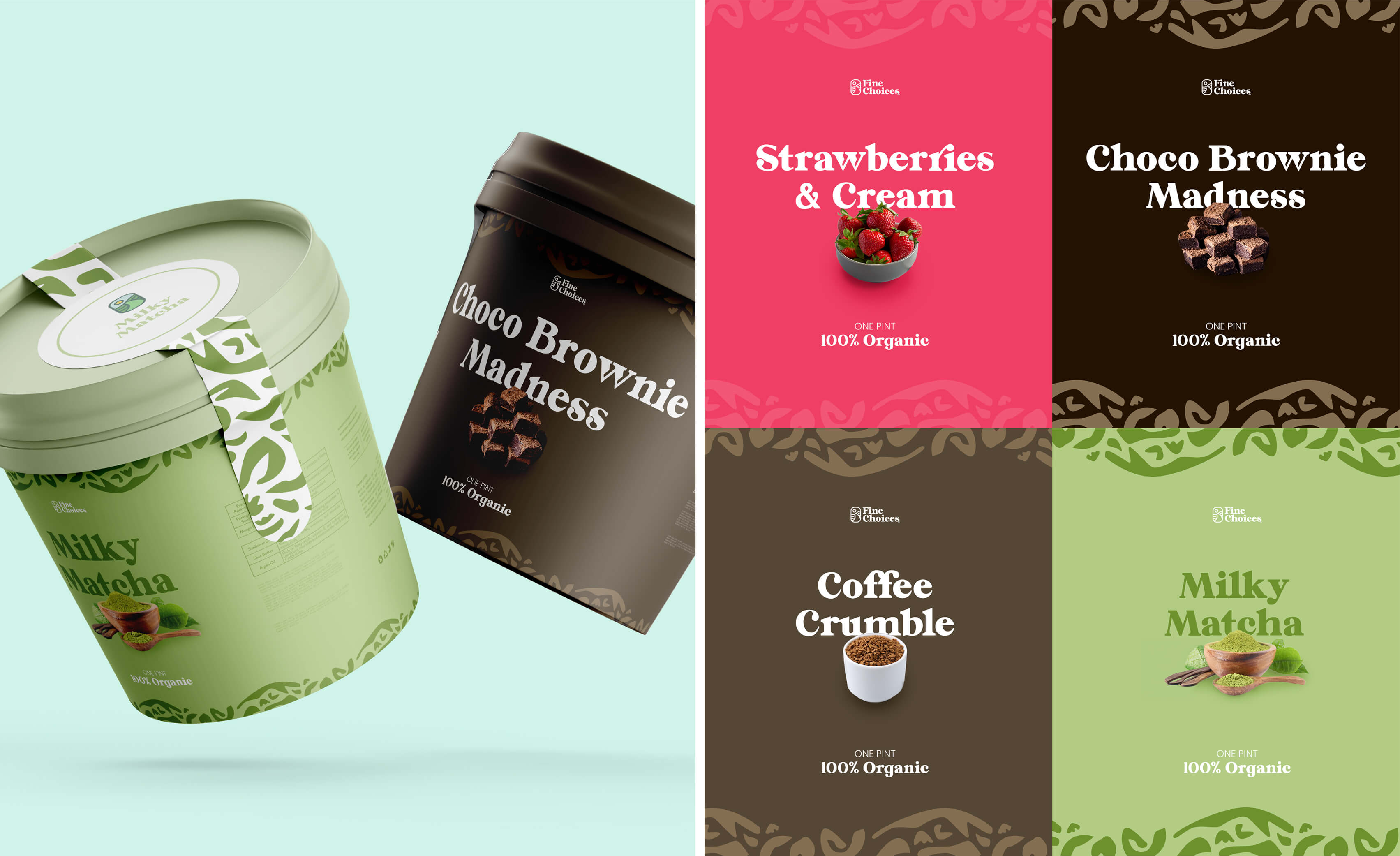
The messaging was refined to connect personal origin to broader mission, empathetic without being precious, clear without being clinical, accessible to anyone trying to make better choices about what they eat. The visual identity was redesigned to reflect what the brand actually represented: wellness, care, and trustworthiness. Not sterile or overly medical, but thoughtful and grounded.
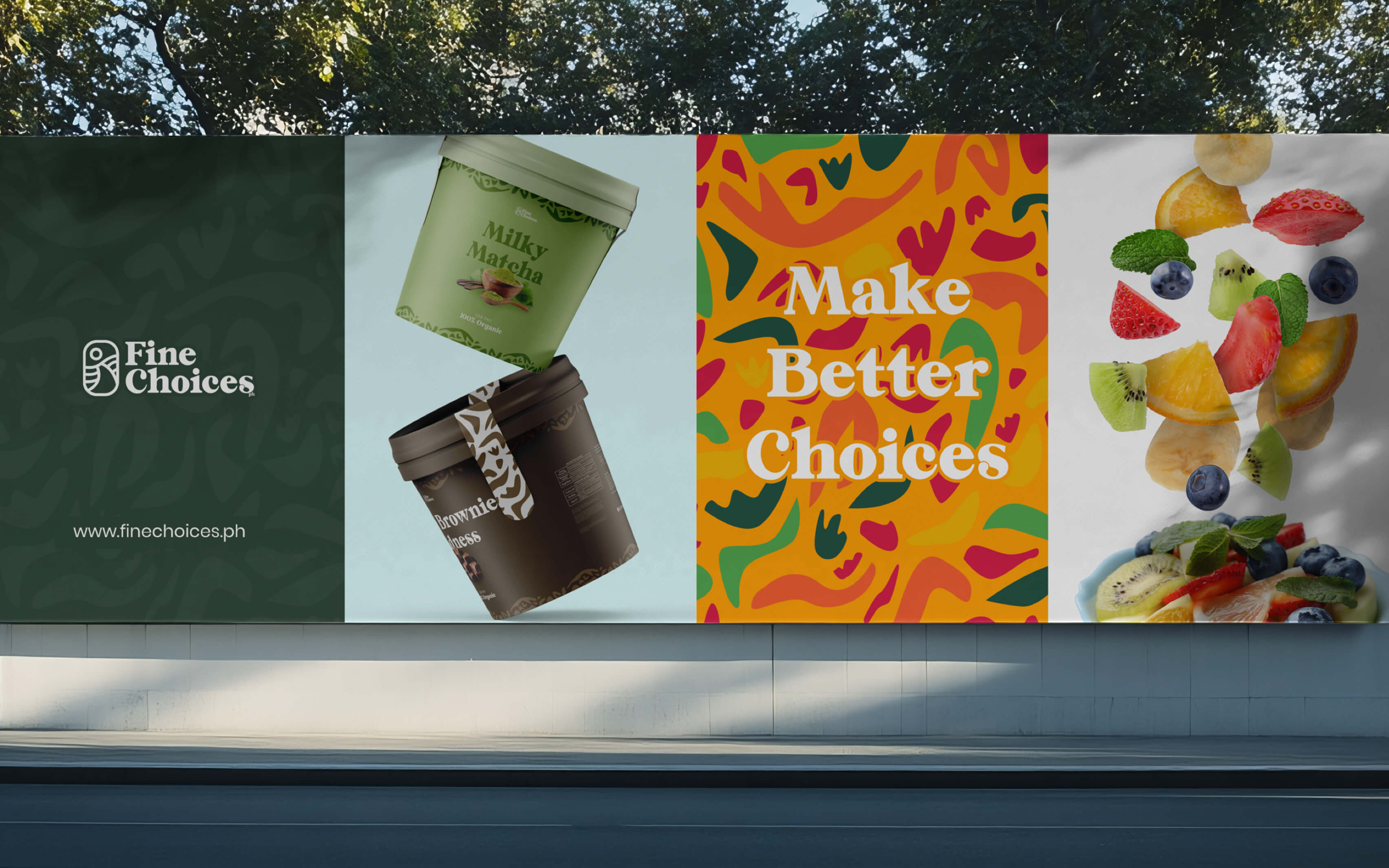
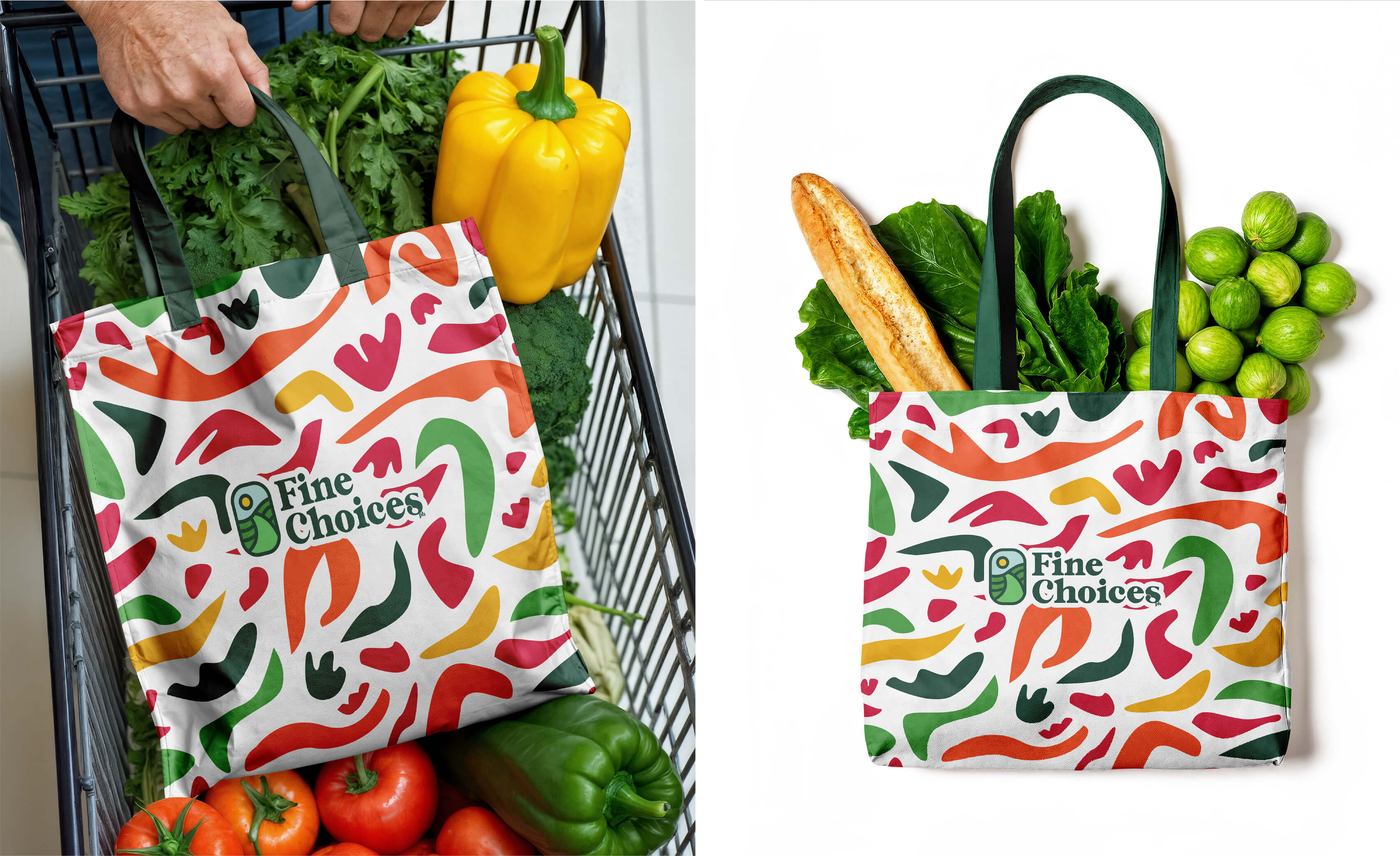
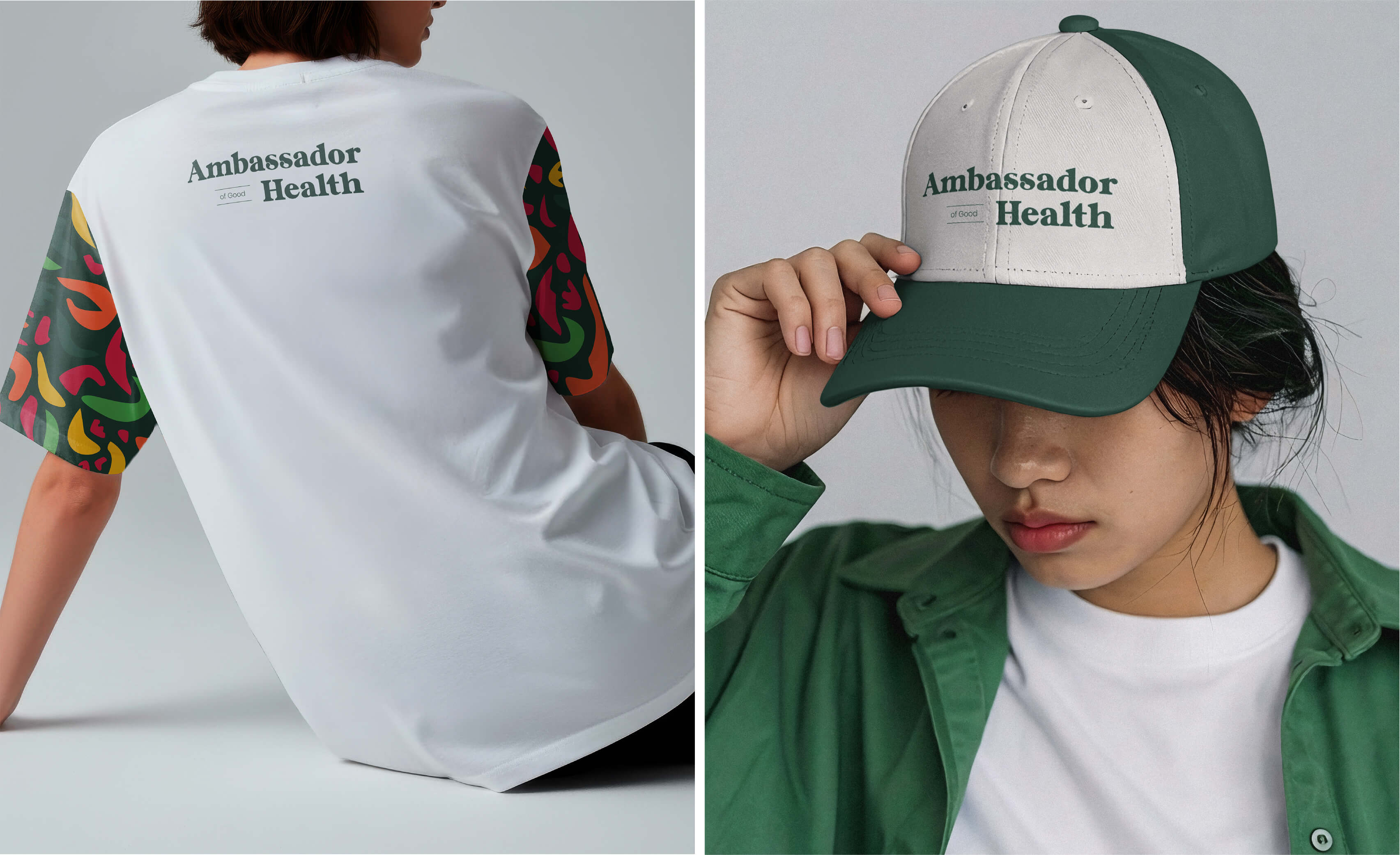
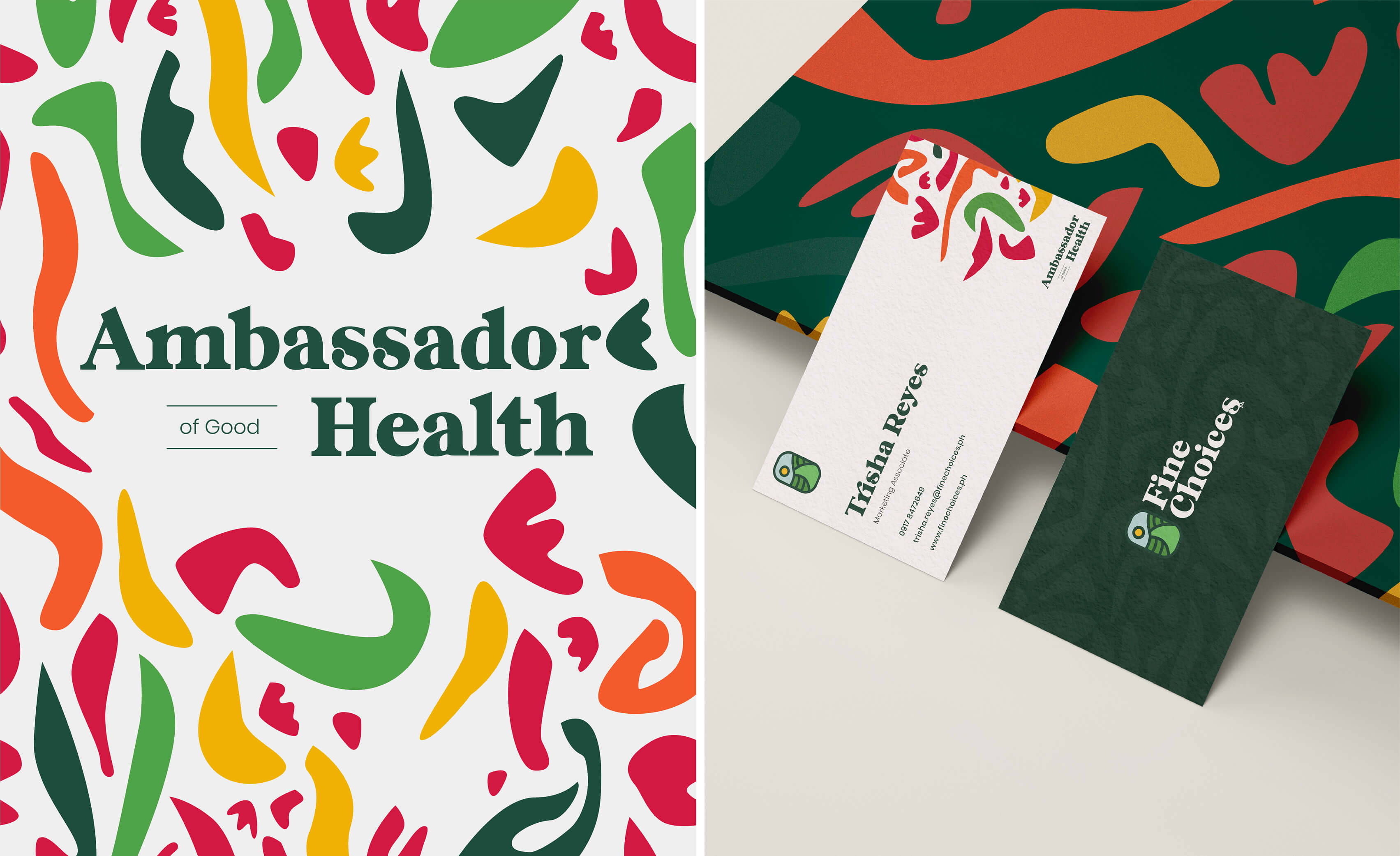
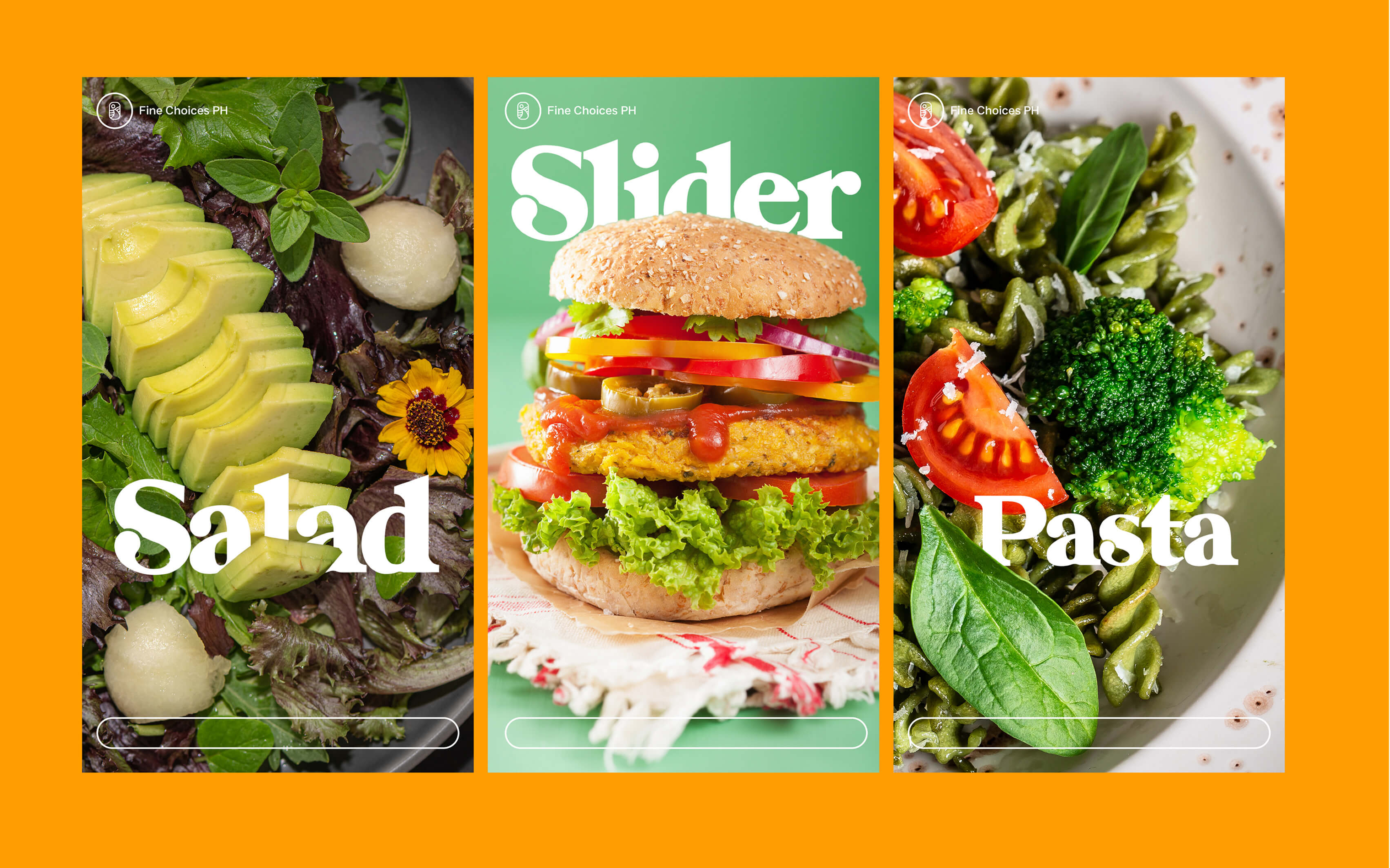
Every touchpoint, packaging, website, social content, marketing materials, was brought into alignment so the brand spoke with one consistent voice.
The Work
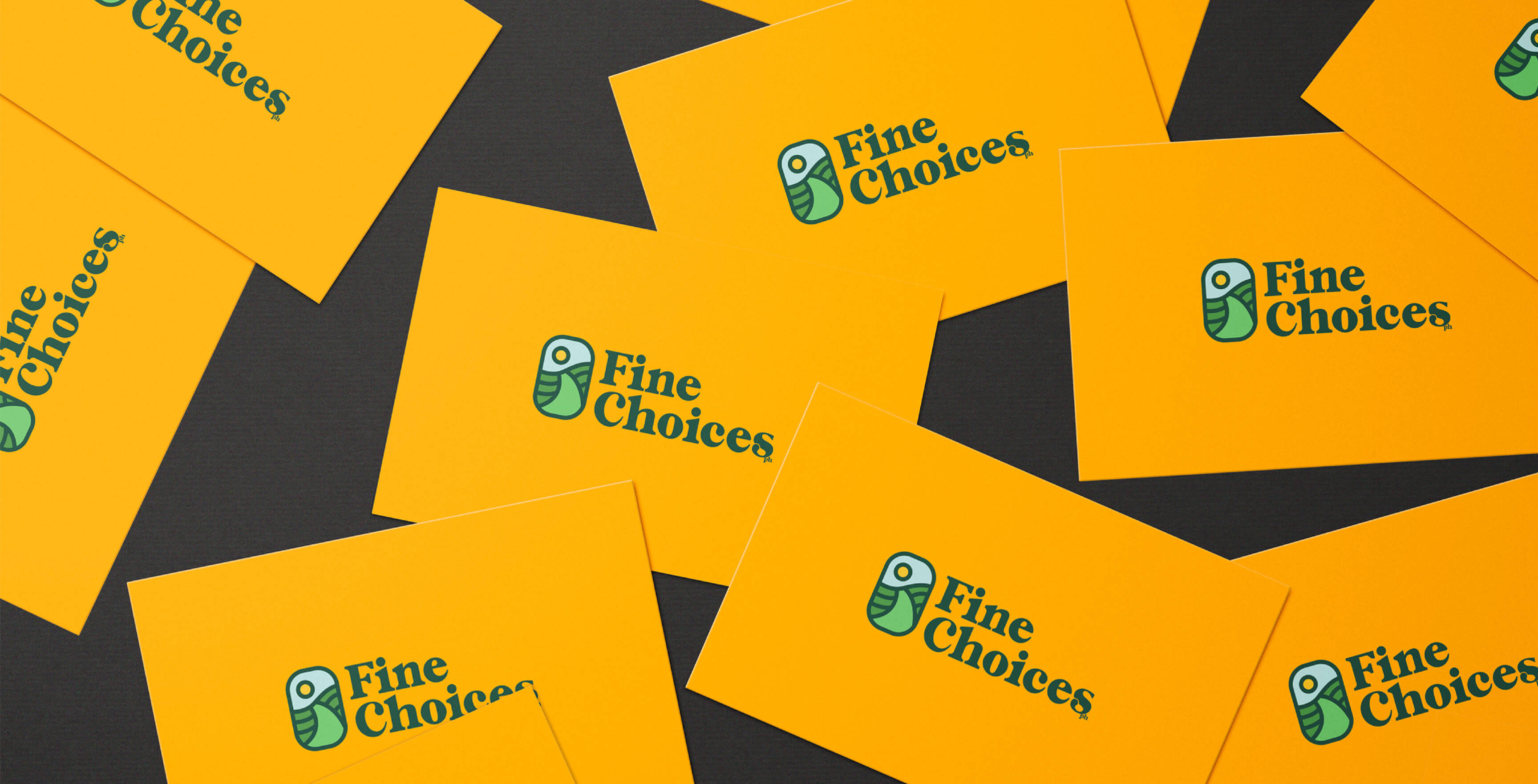
Brand strategy. Brand narrative development. Brand identity redesign. Visual identity system. Messaging framework. Packaging direction. Marketing collateral. Digital brand presence.
Fine Choices finally had a brand that matched its purpose. The narrative became clearer and more confident, connecting the founder's journey to a mission that felt inclusive and forward-looking rather than limited or reactive.
The visual and written materials started working together instead of existing in parallel. Customers encountered a consistent brand presence across every touchpoint. And critically, the brand was now built to grow, rooted in something real but flexible enough to evolve as the product line and audience expand.
Fine Choices went from having a powerful story trapped under inconsistent execution to having a brand that clearly reflects why it exists.