(01)
.jpg)
Studios
Digital Content Production Arm (Coming Soon)
(02)
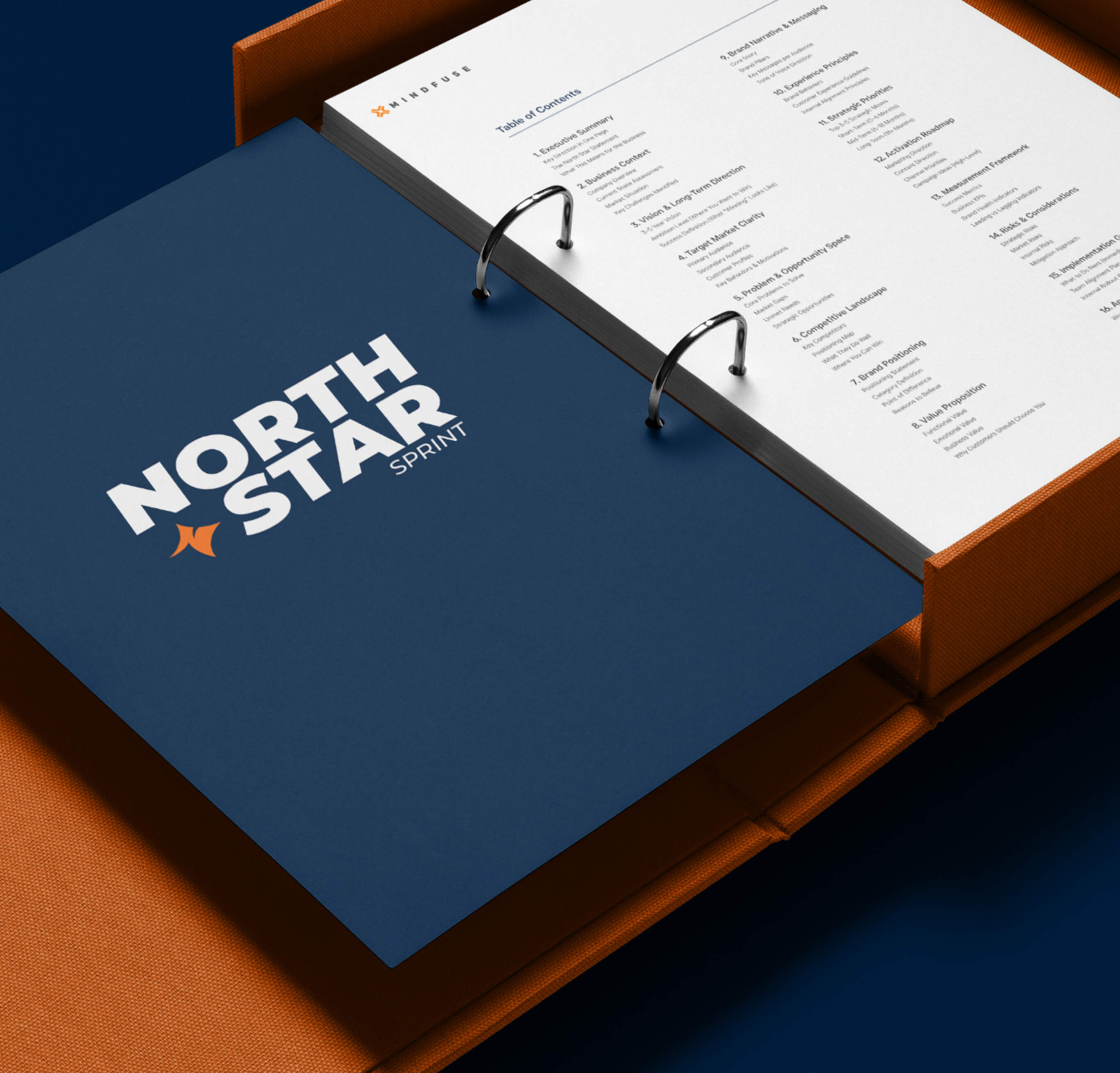
North Star Sprint
Strategic Alignment Workshop
(03)
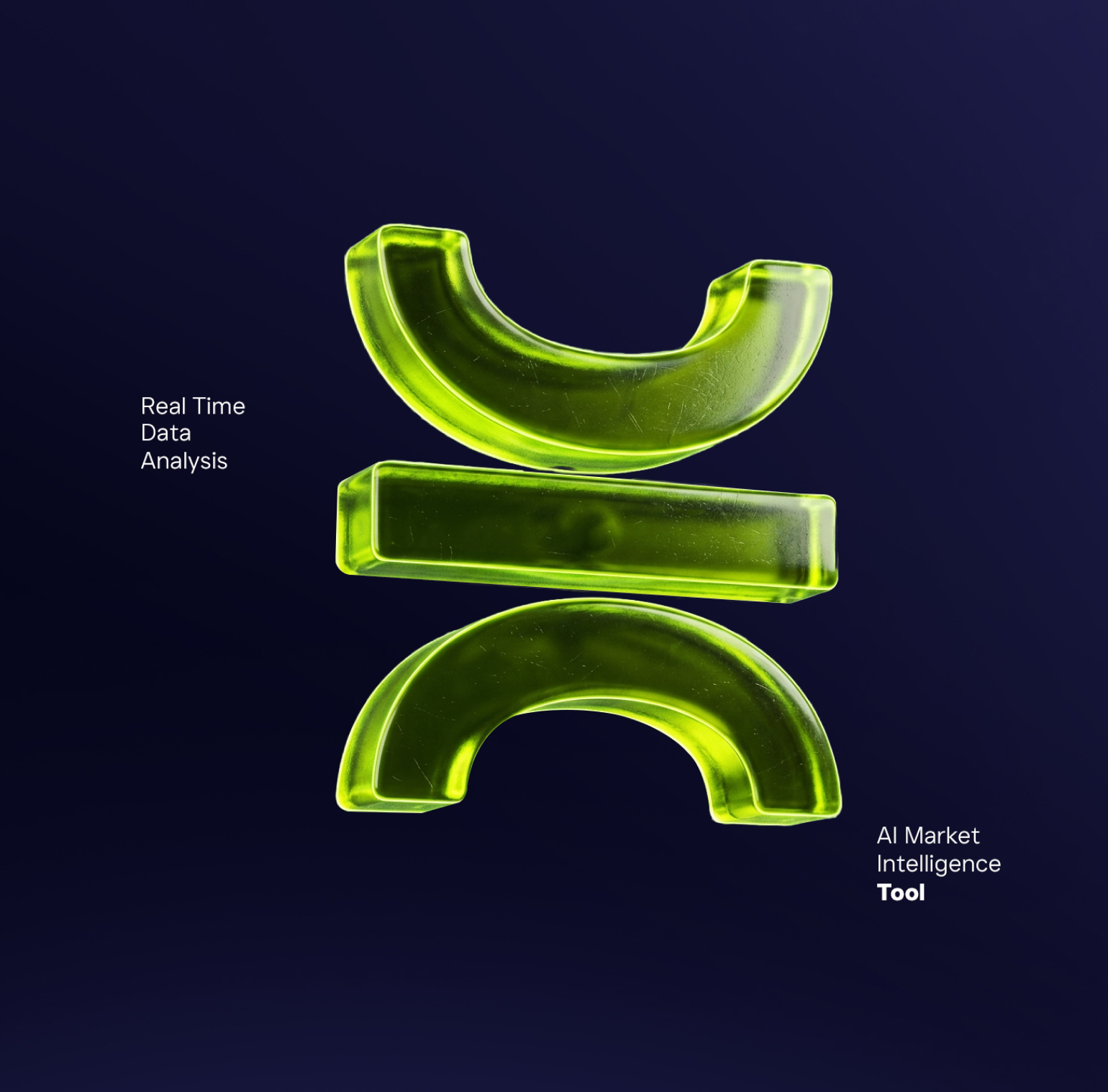
Cortex
AI Powered Intelligence Software
(Exclusive to Clients)
(Exclusive to Clients)
Close
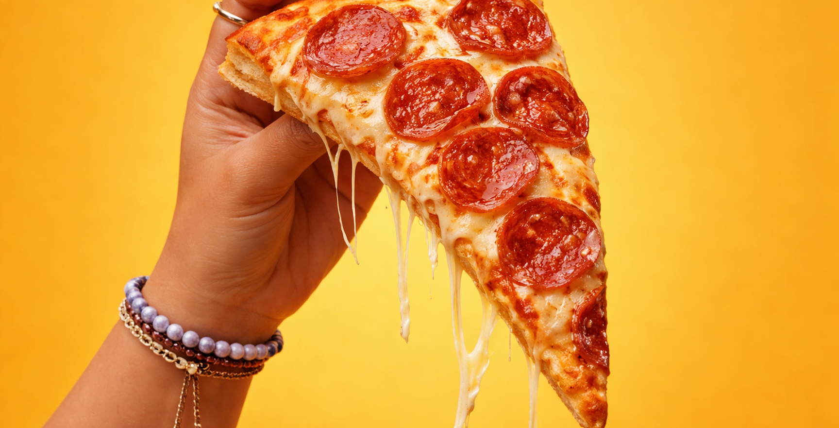
Angel's Pizza is one of the fastest growing pizza chains in the Philippines. Founded in 2009 under the Figaro Coffee Group and led by the Liu family, it grew from a modest local pizza operation into a nationwide brand with over 160 stores across Luzon, Visayas, and Mindanao.
The brand's rise was fueled by a simple formula. Generous portions. Honest pricing. Signature flavors like the Creamy Spinach Dip Pizza that turned casual customers into loyal ones. Angel's Pizza did not try to be everything. It just tried to be worth coming back to.
And it worked. Angel's Pizza now accounts for the majority of the Figaro Coffee Group's revenue, with significant investment from Monde Nissin signaling confidence in the brand's trajectory. But what made Angel's Pizza grow was never just the product. It was the experience of being treated like the order mattered.
As more customers shifted to ordering online, the website became a critical extension of the brand. But it had not kept pace. The design felt outdated. The ordering flow confused people. Customers would start an order, lose their way somewhere in the process, and leave.
The data confirmed what the team already suspected. Bounce rates were high. Cart abandonment was a recurring problem. People were giving up halfway through.
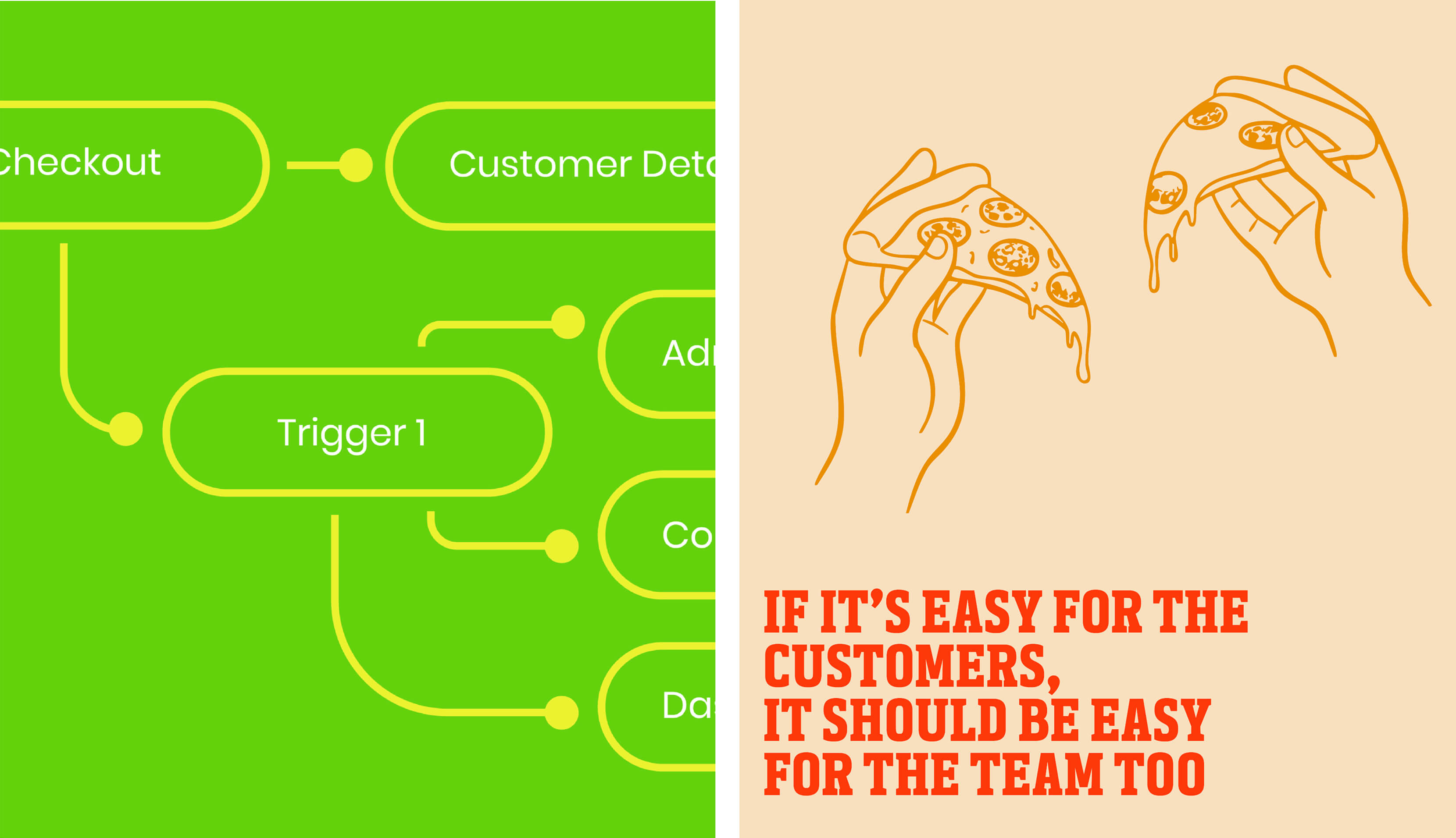
This was not just an interface issue. It was a brand issue. Angel's Pizza had built its reputation on being easy, generous, and customer-first. But the website was telling a different story. It felt like effort. And for a brand that succeeds because it removes friction, that contradiction was costing more than just transactions.
We started where we always start. With the people closest to the work.
We spoke with the business team about what success looks like on their end. We listened to customers describe where they got stuck and why they hesitated. And we sat with the operations team to understand what happens after someone hits "order", where things slow down, where errors creep in, where the system creates more work instead of less.
What emerged was a clear picture. The problem was not one thing. It was three things pulling in different directions.
The Customer
Ordering needed to be fast and intuitive. Customers should never have to second-guess what to do next.
The Brand
The website had to feel like Angel's Pizza, warm, straightforward, and unmistakably theirs. Not another generic food delivery interface.
The Team
The people processing orders needed tools that helped them move faster, not a backend that created bottlenecks.
We rebuilt the site from the customer's perspective, not from a database schema, not from an internal org chart, but from the way someone actually thinks when they are hungry and want to order pizza.
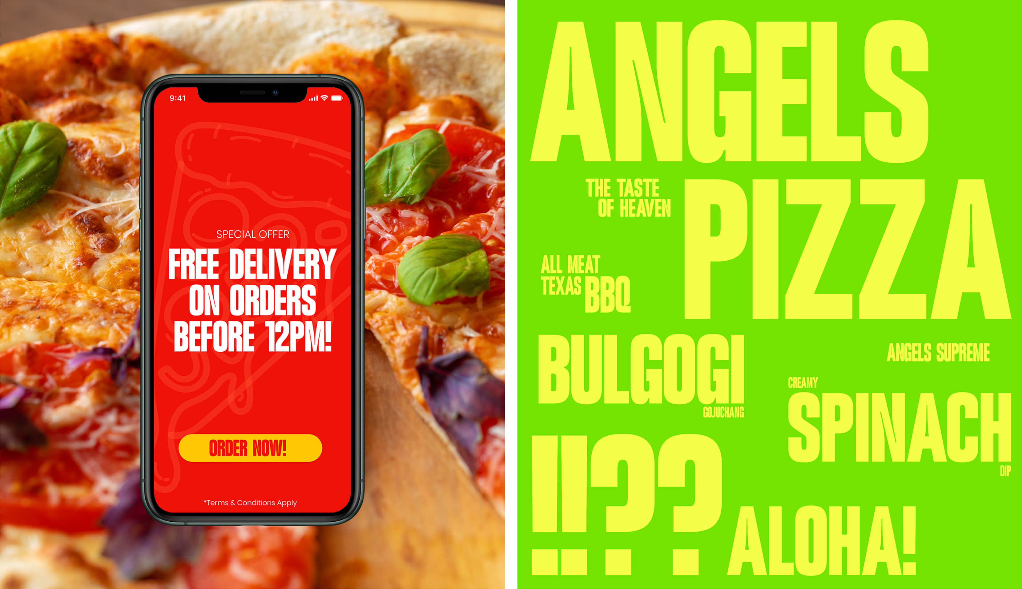
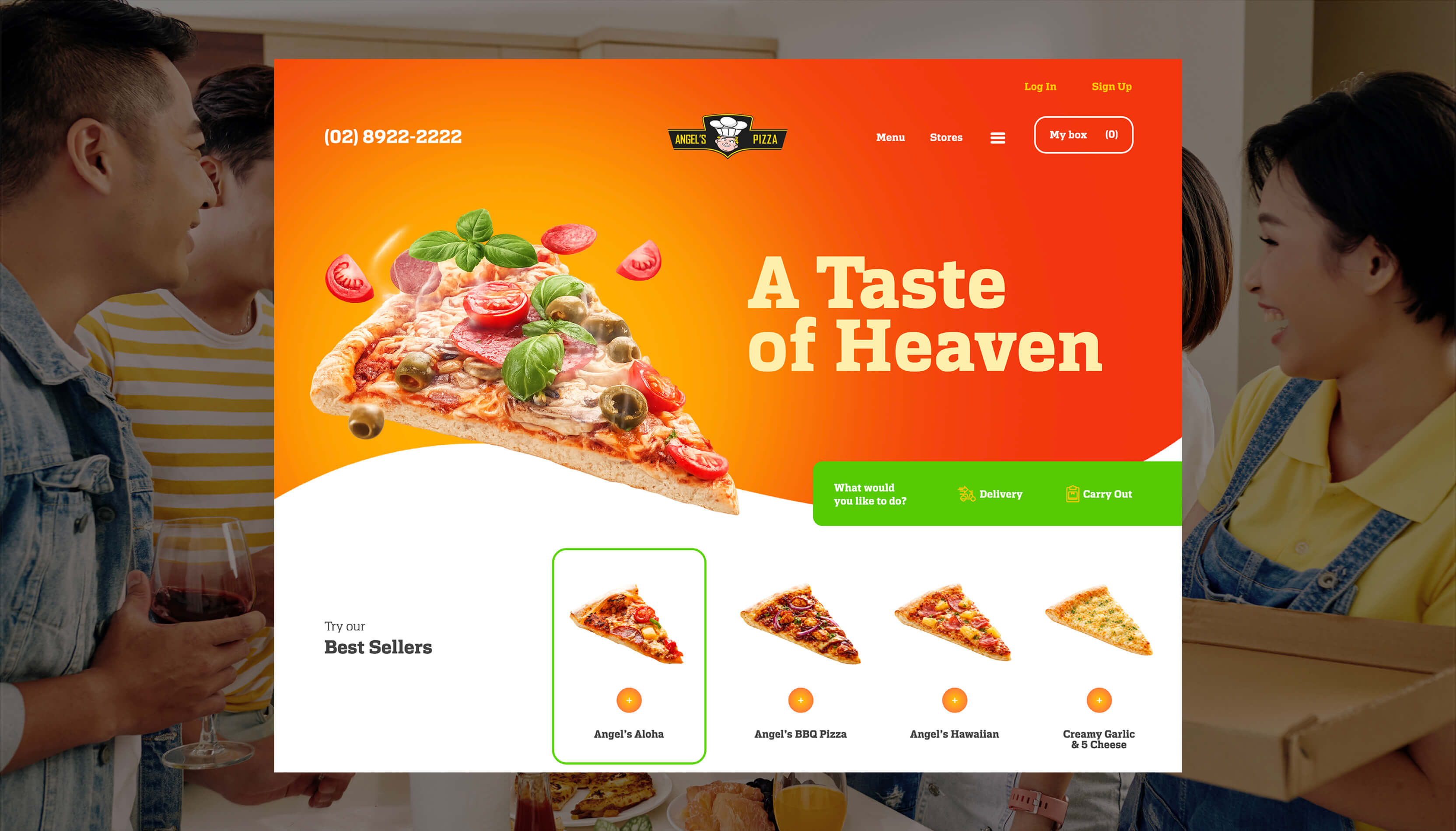
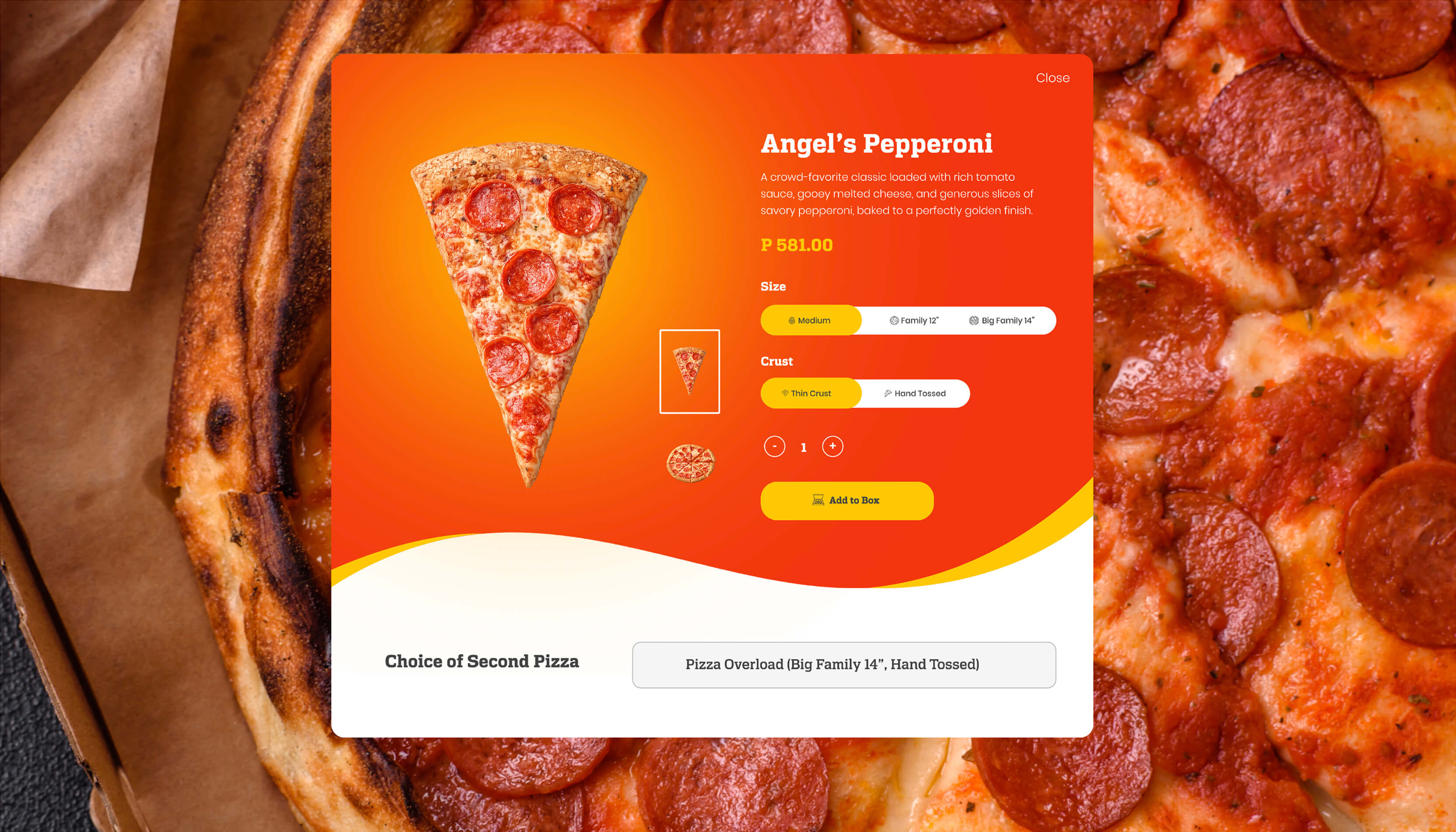
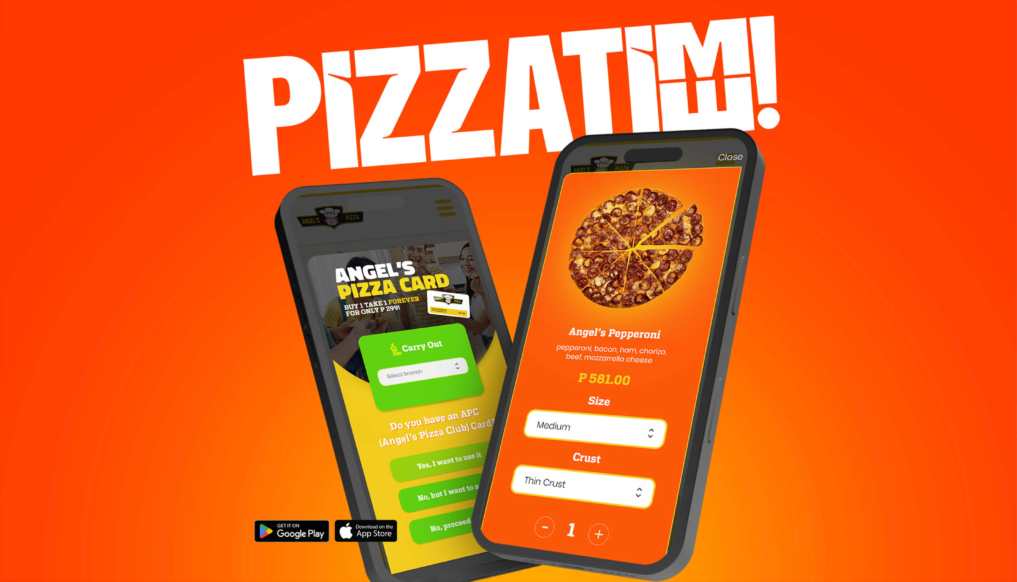
Redesigned the ordering flow
We stripped out the friction. Every unnecessary step, every ambiguous label, every moment that made someone pause and wonder what to do next. The new flow gets out of the customer's way.
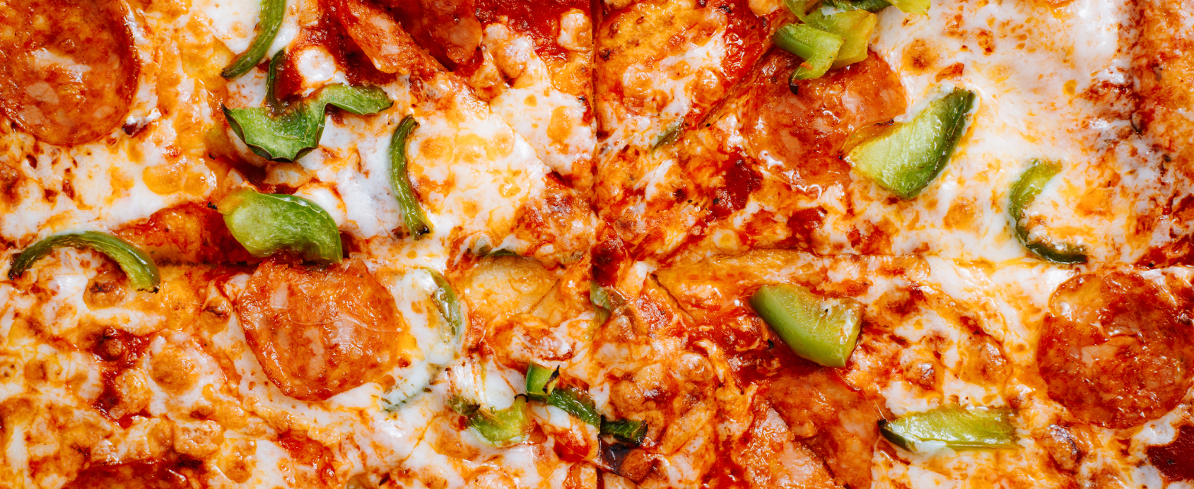
Restructured the menu
We organized the menu around how customers actually think when they are deciding what to eat, not how a system categorizes products. The result is a menu that feels natural, not navigational.
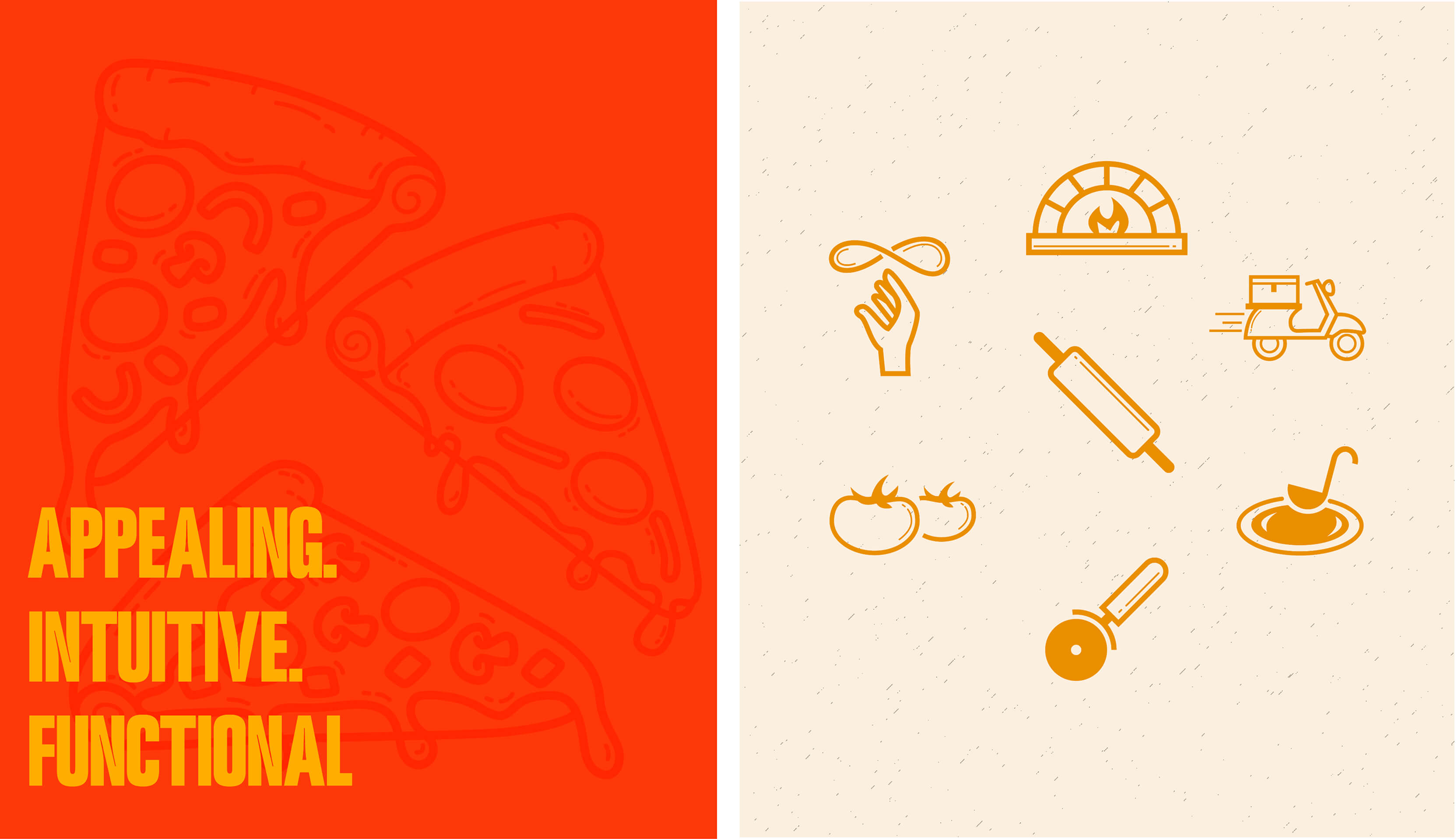
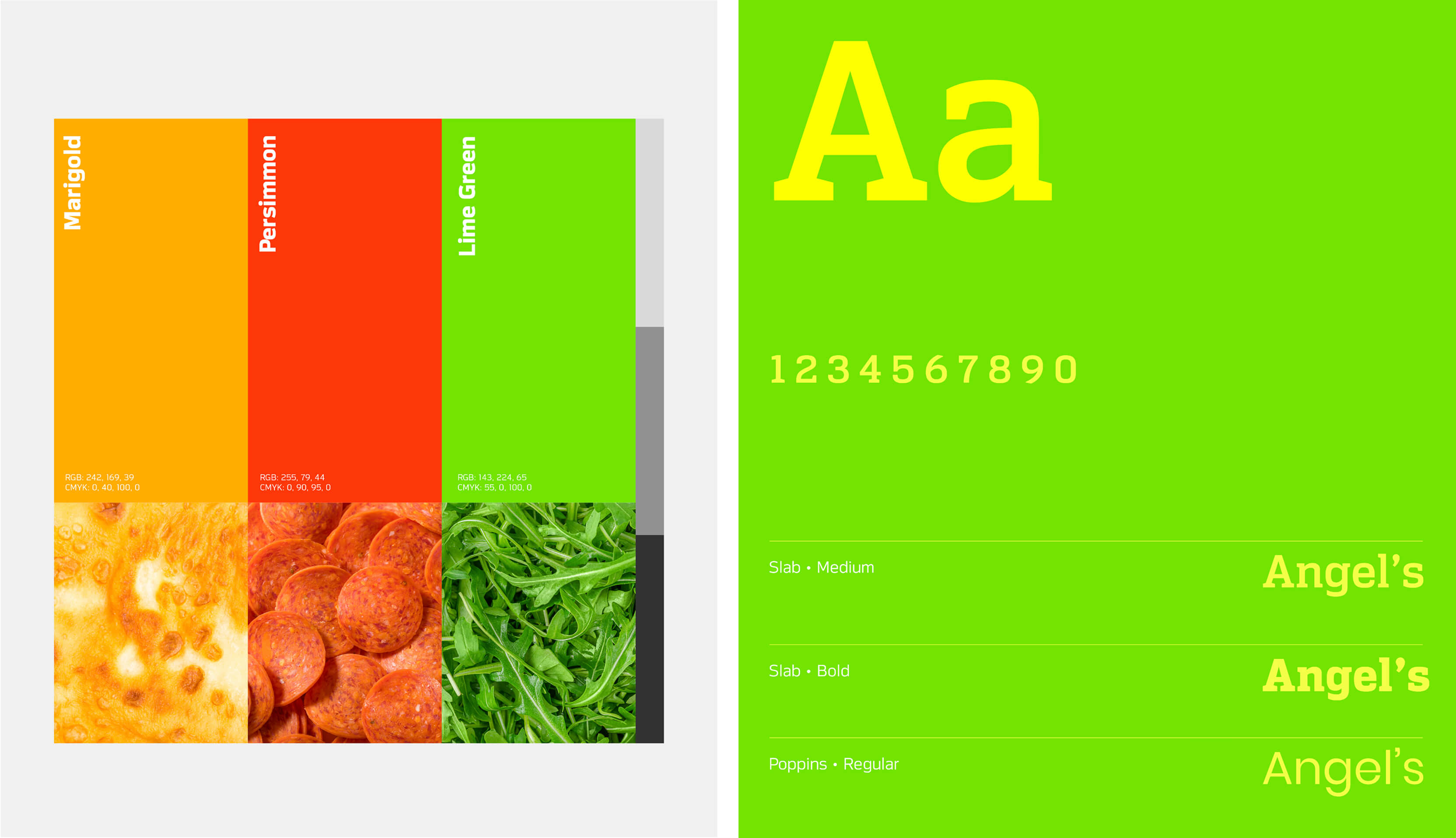
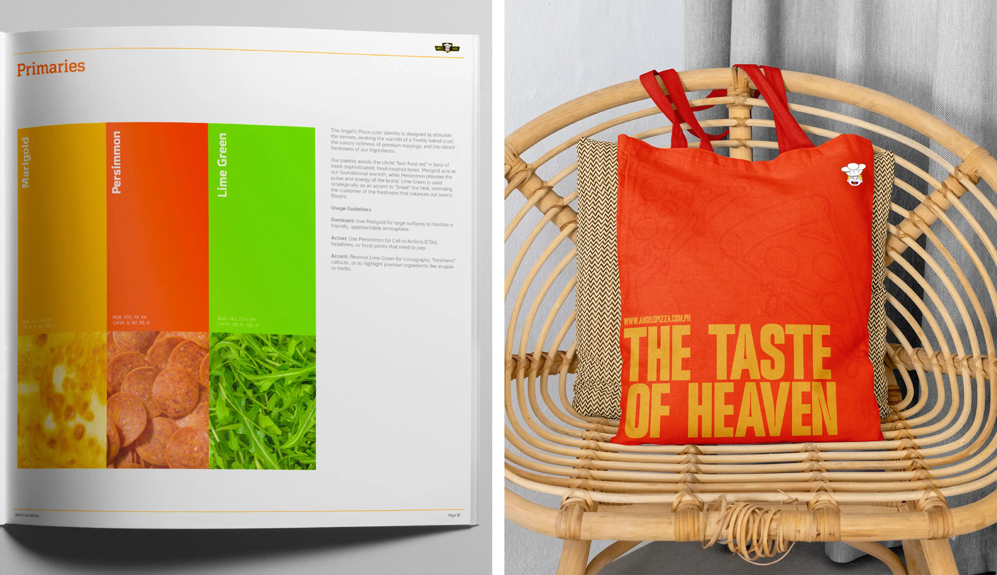
Captured the brand's personality
The visual direction had to feel bold, friendly, and unpretentious — just like the brand itself. We made sure the site felt unmistakably like Angel's Pizza, not a generic ordering template with their logo on top.
Rebuilt the backend experience
The operations side got the same attention as the customer side. Orders now move through the system with less manual handling, fewer errors, and faster processing times.
The Work
Website redesign and development, user experience strategy, ordering flow optimization, menu architecture, backend operations interface, and responsive design across devices.

The new site works better in ways we can measure and ways people can feel.Customers move through the ordering process with less hesitation. The path from craving to checkout is clearer and faster. On the operations side, orders get processed with fewer steps and fewer errors. And the business saw what matters most: more people completing their orders and coming back.
Customer Experience
A faster, more intuitive ordering flow that reduces drop-off and removes hesitation
Brand Consistency
A digital presence that finally matches the warmth and personality of the brand itself
Operations
A backend that processes orders faster with fewer manual steps and fewer errors
Business Impact
Higher order completion rates and increased repeat visits